Templates
Title (title)

It's what it says on the tin. Title is created from the name property and supports an optional icon. It has an automatic width and so you can put things next to it in a horizontal stack and you can mirror it so it goes right-to-left if you need. Examples of these variations can be seen in the image on the docs homepage.
Title Variables
| Variable | Values | Default | Description |
|---|---|---|---|
color |
String (CSS) | var(--cbc-title-color, var(--primary-background-color)) |
The color of the icon |
text_color |
String (CSS) | var(--cbc-title-text-color, var(--cbc-title-color, '#ffffff')) |
The color of the title text. |
background_color |
String (CSS) | var(--cbc-title-background-color, var(--accent-color)) |
The color of the background |
opacity |
Number | var(--cbc-title-opacity, 0.4) |
Opacity applied to the background color (text remains at full opacity). |
uppercase |
Boolean | true |
Transform the title text to uppercase. |
mirror |
Boolean | false |
Run right-to-left instead of left-to-right |
show_tab |
Boolean | false |
Show a colored tab edge on the card. |
offset |
String/Number | 0 |
Horizontal offset for the card. |
icon_size |
String (CSS) | 155% |
Icon width and height. |
Title Example YAML
See the YAML...
type: custom:button-card
template: title
name: Title for Hotdogs
icon: mdi:hotdog
variables:
  color: var(--primary-background-color)
  background_color: var(--state-icon-color)
  mirror: false
Landscape Button (button_landscape)
This template serves as the base template for the device and light templates. You probably won't need to use it yourself until you step up to the advanced Through it's configuration and addons which it inherits it has features to reduce the card size and opacity if the entity is unavailable, hide the label containing extra information (like attributes or brightness and color for lights) when the entity is off, highlight elements when you hover over it to show it's interactive, set a max-height and include the standard set of actions.
🙋♂️ Remember if a template inherits an addon you can just use those variables to change the properties when using this template. For example; a card with only the
button_landscapetemplate specified can accept thewidthandheightvariables from theresizableaddon. This is the case for all templates and addons. Also inheritance is recursive so if a template inherits another template it also inherits that templates inherited templates right back through the chain. So when you use thelighttemplate you get all of the options listed here as well.
Landscape Button Inherits
Landscape Button Variables
| Variable | Values | Default | Description |
|---|---|---|---|
off_hide_info |
Boolean | true |
Hides the Extra Information or label (eg. brightness and color on lights or the attributes on devices) when the entity is off. Set to false if you wish to display this content while the entity is off. Keep in mind that some attributes are not available when an entity's state is off. |
min_height |
String (CSS) | 80px |
Minimum height of the card. Inherited from resizable. |
Action Button (button_action)
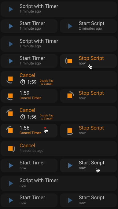
The Action button is for Automation, Scripts or Timers. It has an animated icon while running and it shows the last run time when idle. You can customise the name property which defaults to "Start" and you can also specify a different name while it's running using the name_on variable which defaults to "Cancel".
If you define a timer as the entity then a tap will start the timer and while active it will show the time remaining and you can tap again to cancel the timer. If you provide a Script or Automation entity that starts a timer in it's actions/sequence then you can use the timer variable to specify the timer and it will be shown when active, even if the Script/Automation is finished/idle. It will show until the timer runs out or you can double tap to cancel the timer.
Action Button Inherits
- cbcjs
- state_helper
- style_helper
dynamic_iconsresizable- interactive
Action Button Variables
| Variable | Value Type | Default | Description |
|---|---|---|---|
timer |
timer.* |
A timer entity that is started by your script. Not required if your entity is already a timer. |
|
icon_on |
mdi:* |
mdi:stop |
Set a custom icon for while the script/timer is running. Inherited from dynamic_icons. You can use the card icon property to change the default icon (mdi:play). |
name_on |
String | Cancel |
Set a custom name for while the script/timer is running. You can use the card name property to change the default name (Start). |
min_height |
String (CSS) | 55px |
Minimum height of the card. |
Action Button Example YAML
See the YAML...
- type: custom:button-card   #### Action Script with Timer ####>
  template: button_action
  entity: script.test_script
  name: Script with Timer
  variables:
    height: 50px
    timer: timer.test_timer
  triggers_update: timer.test_timer
- type: grid
  square: false
  columns: 2
  cards:
    - type: custom:button-card   #       #### Action Timer ####>
      template: button_action
      entity: timer.test_timer
      name: Start Timer
      variables:
        height: 45px
        name_on: Cancel Timer
    - type: custom:button-card
      template: button_action
      entity: script.test_script_2 #    #### Action Script ####>
      name: Start Script
      variables:
        height: 45px
        name_on: Stop Script
Mini Button (button_mini)
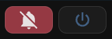
This is a little button which only displays an icon with the option of defining a single text character or another icon as a symbol which will display in front of the main icon. These are great for in a horizontal-stack next to the title to control a group or for things like Do Not Disturb (DND) toggles. Of course you can use them for whatever you need. I nearly always add dynamic_icons to them.
🙋♂️ The first button in the examples is using the button-card
color_typeproperty set tocard. Check out all the button-card options here.
Mini Button Inherits
🧨 Breaking Change:
icon_widthhas been replaced withicon_min_size/icon_max_size, and the default minimum card/icon sizes are now 45px/35px.
Mini Button Variables
| Variable | Values | Default | Description |
|---|---|---|---|
min_height |
String (CSS) | 45px |
Minimum height of the card. |
min_width |
String (CSS) | 45px |
Minimum width of the card. |
icon_min_size |
String (CSS) | 35px |
Minimum icon size. Replaces icon_width. |
icon_max_size |
String (CSS) | Maximum icon size (optional). | |
symbol |
1-2 Character String OR mdi:* |
1-2 characters of text or an icon to identify the light | |
symbol_width |
String (CSS) | 50% |
Only applies if the symbol is an icon (mdi:*). Adjust if the symbol doesn't fit |
symbol_font_size |
String (CSS) | auto |
Only applies if the symbol is a string. Adjust if the symbol doesn't fit |
symbol_color |
String (CSS) | var( --ha-card-background, var(--card-background-color, white) ) |
Set a custom symbol color |
symbol_margin_top |
String (CSS) | 0 |
Adjust vertical positioning for the symbol. |
symbol_padding |
String (CSS) | Add padding around the symbol. |
Mini Button Example YAML
See the YAML...
See examples of symbol usage in the light_group section.
- type: custom:button-card #          ####| Button Mini DND |####>
  template:
    - button_mini
    - dynamic_icons
  color_type: card
  color: "#9d3042"
  entity: input_boolean.do_not_disturb
  variables:
    icon: mdi:bell
    icon_on: mdi:bell-off
    width: 70px
- type: custom:button-card #        ####| Button Mini Power |####>
  template: button_mini
  icon: mdi:power
  entity: switch.all_things
  variables:
    width: 70px
Entity (entity) previously Device (device)
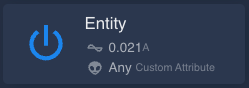
For any entity which has on/off state. It can optionally display up to 2 attributes from the entity or other entities with custom icons, values and units.
🧨 Breaking Change:
devicestill works for now but is deprecated in favour ofentityand is planned for removal in a future1.xrelease.🙋♂️ If you don't know what attributes are available on your entity you can use the more-info dialogue or check out the
entity_detailstemplate
Entity Inherits
button_landscape
Entity Variables
| Variable | Value Type | Default | Description |
|---|---|---|---|
attributes |
Array of Attribute Items | [] |
A list of up to 2 Attribute Item objects. See Attribute Item below for available properties. |
attribute_icon_color |
String (CSS) | Set a custom color for the attribute icons. |
Attribute Item
| Property | Value Type | Default | Description |
|---|---|---|---|
id |
entity.attributes.* |
- | The id of the attribute to display eg. friendly_name. |
entity |
entity_id |
entity.entity_id |
Optional source entity for this attribute/state. Defaults to the main entity. |
use_state |
Boolean | true when entity is provided, otherwise false |
Show the entity state instead of an attribute. |
icon |
mdi:* |
- | The icon to use for the attribute. |
state |
String | - | Override the displayed value with a custom string. |
units |
String | - | The unit of measurement (if required) for the attribute value. |
prefix_units |
Boolean | false |
When true units will appear before the value. |
🧨 Breaking Change: Attribute rows now deduplicate by
id, render in a flex row, andid: stateis replaced byuse_state: truefor showing the main entity state.
Entity Example YAML
See the YAML...
type: custom:button-card
template: entity
entity: switch.wmd_activate
name: Entity
icon: mdi:nuke
variables:
  attributes:
    - id: voltage
      icon: mdi:alien
      units: Attribute
Smart Plug (plug)
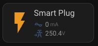
Intended for use with smart plugs which have energy metering attributes. Add the smart plug entity and you're good to go. You can also override the default attribute items and source those values from separate entities.
Plug Inherits
entity
Plug Extra information
- Current: The current being used currently (lol) from the
currentattribute. - Voltage: The voltage from the
voltageattribute. - Separate attribute sources: Each attribute item can define its own
entity, so current/voltage can come from different sensors or helper entities.
Plug Example YAML
See the YAML...
type: custom:button-card
template: plug
entity: switch.smart_plug
name: Smart Plug
variables:
  attributes:
    - id: current
      entity: sensor.smart_plug_current
    - id: voltage
      entity: sensor.smart_plug_voltage
Light (light)
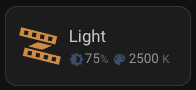
For use with light entities. Just specify the entity and the template should do the rest of the work for you. The icon color is set to auto so will mimic the current color of the light. This is a button-card feature and it uses the --button-card-light-color css variable
If the entity exposes effect_list, the card will show the active effect name. Enabling the effect selector adds a dropdown to start/stop effects and, where a select.<light>_theme (or matching light item theme select) exists, a companion theme picker is shown.
Light Inherits
button_landscape
Light Extra Information
- Effects: If the entity is currently running an effect it will display the effect name derived from the
effectattribute.
When there is not an effect running:
- Brightness: The brightness percentage will be displayed calculated from the
brightnessattribute. - Color: When the entity's attribute
color_modeis set tocolor_tempthe color temperature in degrees Kelvin will be displayed otherwise thergb_colorattribute will be displayed.
Light Variables
| Variable | Values | Default | Description |
|---|---|---|---|
show |
Object | Display settings for the light. See Light Show Options below. | |
attribute_icon_color |
String (CSS) | var(--state-icon-color) |
Icon color used in the extra information row. |
rgb_symbols |
Array of 3 strings | ['R','G','B'] |
Override the letters used for RGB display. |
strip_show |
Object | Show options for the embedded brightness strip. See Value Strip Show Options below. | |
strip_items |
Array of Value Strip Items | [] |
Custom items for the embedded brightness strip. |
Light Show Options
| Property | Values | Default | Description |
|---|---|---|---|
info |
Boolean | true |
Show the extra info row (effects / brightness / color). |
brightness_strip |
Boolean | false |
Show the embedded brightness value_strip. |
effect_selector |
Boolean | false |
Show the effects dropdown (and theme picker if available). |
To display the effect selector and (if available) theme selector:
type: custom:button-card
template: light
entity: light.lounge
variables:
  show:
    effect_selector: true
When show.effect_selector is enabled, the card will render:
- an Effects dropdown if light.<name> has an effect_list
- a Theme dropdown automatically when select.<light_object_id>_theme exists.
Light with Motion Sensor (light_motion)
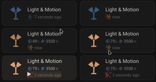
For use with light entities which are controlled by a motion or occupancy sensor. Shows the extra information of the light as well as when occupancy/motion is or was last detected. You specify the light entity for the card and then the sensor in the motion_entity variable. The automation for activating the light must already be configured. This button does not provide an automation.
Light Motion Inherits
Light Motion Variables
| Variable | Values | Default | Description |
|---|---|---|---|
motion_entity |
binary_sensor.* |
The entity_id of the motion/occupancy sensor which activates the light in your automation. |
|
active_entity |
input_boolean.* |
Optional helper to pause/resume the automation directly from the motion pill. | |
timer_entity |
timer.* |
Optional timer entity used to show remaining pause time and switch the row to the timer view while active. |
Light Motion Example YAML
See the YAML...
type: custom:button-card
template: light_motion
entity: light.my_light
variables:
  motion_entity: binary_sensor.my_motion_sensor
Light Group (light_group)
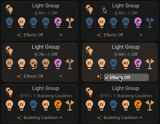
For use with small light groups (up to 6) like multi-globe lamps. Specify a light group and you can have up to 6 separate lights with custom icons and symbols all controlled on one card. The main card controls the group and each individual light can be controlled from an embedded button_mini.
If you're feeling lazy then just specify the light group entity and up to the first 6 lights from the group will be automagically added to the card for you with lightbulb icons and numbered 1-n. Alternatively you can specify the list of lights manually and control the icons and symbols that are used.
Light Group Inherits
Light Group Variables
| Variable | Values | Default | Description |
|---|---|---|---|
items |
Array of Light Items | [] |
A list of up to 6 lights to display. See the Light Item table below for available properties. |
item_template |
String (template name) | button_mini_embed |
Override the template used for each embedded light button. |
Light Item
| Property | Values | Default | Description |
|---|---|---|---|
entity |
light.* |
The entity_id of the light Required |
|
icon |
mdi:* |
mdi:lightbulb |
The icon for the light. |
symbol |
Single Character String OR mdi:* |
A single character of text or an icon to identify the light | |
symbol_width |
String (CSS) | 50% |
Only applies if the symbol is an icon (mdi:*). Adjust if the symbol doesn't fit |
symbol_font_size |
String (CSS) | 10pt |
Only applies if the symbol is a string. Adjust if the symbol doesn't fit |
symbol_color |
String (CSS) | var( --ha-card-background, var(--card-background-color, white) ) |
Set a custom symbol color |
Light Group Example YAML
See the YAML...
#...
  - type: custom:button-card #                 ####| Light Group Auto |####>
    template:
      - light_group
    entity: light.light_group
    name: Light Group Auto
  - type: custom:button-card #               ####| Light Group Custom |####>
    template:
      - light_group
    entity: light.light_group_passage
    name: Light Group
    variables:
      items:
        - entity: light.stairs
          symbol: mdi:stairs_left
          symbol_color: red
        - entity: light.cabinet_left
          symbol: C
        - entity: light.kitchen_left
          symbol: mdi:pot-steam
        - entity: light.stairs_right
          symbol: mdi:stairs
        - entity: light.cabinet_right
          symbol: C
        - entity: light.kitchen_right
          symbol: mdi:pot-steam
Climate (climate)
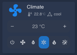
Climate control card that combines the standard entity view with an embedded tile for HVAC mode selection and target temperature adjustments. Supports toggling via a linked switch_entity if your setup separates on/off control.
Climate Inherits
entitydynamic_icons
Climate Variables
| Variable | Values | Default | Description |
|---|---|---|---|
switch_entity |
switch.* |
false |
Optional switch entity to handle on/off outside of the climate domain. |
attributes |
Array of Attribute Items | current_temperature, state |
Attribute rows to display under the title. |
features |
Array | target-temperature, climate-hvac-modes (icons) |
Tile features to render inside the embedded control. |
Climate Example YAML
See the YAML...
type: custom:button-card
template: climate
entity: climate.lounge
variables:
  switch_entity: switch.lounge_power
  features:
    - type: target-temperature
    - type: climate-hvac-modes
      style: icons
Cover (cover)
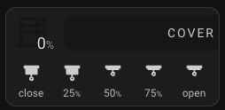
Cover control card for blinds, curtains, shutters, garage doors, and other cover entities with a numeric position. It combines a compact position readout with an embedded value_strip configured for cover positions, so you can jump straight to common open/close percentages.
Cover Inherits
- cbcjs
Cover Variables
| Variable | Values | Default | Description |
|---|---|---|---|
mirror |
Boolean | true |
Swap the position readout and title from left to right. |
position_source |
entity_id | Attribute |
current_position |
Source for the position readout. Use an attribute name from the cover entity or a separate entity ID. |
icon_color |
String (CSS) | #000 |
Icon color for the position readout. |
icon_opacity |
Number | 0.2 |
Icon opacity for the position readout. |
title_advanced |
Boolean | true |
Show the advanced title card instead of the simple button-card name. |
title_background_color |
String (CSS) | #000 |
Background color for the advanced title. |
title_opacity |
Number | 0.2 |
Background opacity for the advanced title. |
title_uppercase |
Boolean | true |
Display the advanced title text in uppercase. |
title_text_color |
String (CSS) | var(--cbc-title-text-color, var(--cbc-title-color, '#ffffff')) |
Text color for the advanced title. |
strip_show_icon |
Boolean | true |
Show icons in the embedded cover value_strip. |
strip_show_step_value |
Boolean | true |
Show values or labels in the embedded cover value_strip. |
strip_show_fade |
Boolean | false |
Fade strip items according to their position value. |
strip_items |
Array of Value Strip Items | [] |
Custom cover strip items. Leave empty to use the default cover value strip items. |
Cover Example YAML
See the YAML...
type: custom:button-card
template: cover
entity: cover.lounge_blinds
name: Lounge Blinds
icon: mdi:blinds-horizontal
variables:
  position_source: current_position
  strip_items:
    - step_value: 0
      icon: mdi:blinds
      units: '%'
      label: close
    - step_value: 50
      icon: mdi:blinds-open
      units: '%'
    - step_value: 100
      icon: mdi:blinds-open
      units: '%'
      label: open
Value Strip (value_strip)
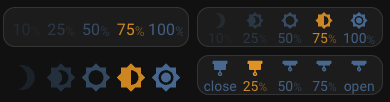
Value strips can be used to control anything which has a gradual, numeric value. The most obvious examples are brightness / color of lights, covers position (like blinds and garage doors) or temperature for environmental controls. Let your imagination run wild though, they can be customised and used for anything you like. They give you quick tap access to 5 pre-set values and if the value of an item matches the value of the target then they are set to active and highlighted.
There are built-in options for brightness, cover, fan, fan_mode, climate, or a custom value. You can also mix item types in a single strip by setting type on individual items.
Value Strip Variables
| Variable | Property | Values | Default | Description |
|---|---|---|---|---|
type |
domain | value | brightness | cover | fan | fan_mode | climate |
domain |
The type of value strip. See Value Strip Types below for descriptions of the available values. | |
show |
Object | Display settings. See Value Strip Show Options below. | ||
items |
Array of value strip items | See Value Strip Types | Define the items in your value_strip. See value strip item below for available properties. |
Value Strip Show Options
| Property | Values | Default | Description |
|---|---|---|---|
icon |
Boolean | true |
Show the icon for each value. |
step_value |
Boolean | true |
Show the value text and units for each value. |
fade |
Boolean | true |
Fade the items according to their value (best with brightness). |
Value Strip Types
domain: (default) Automatically chooses a built-in type from the entity domain. Lights usebrightness; covers, fans, and climate entities use their matching type. Other domains fall back tovalue.value: This is for creating completely custom Value Strips. You will need to provide the array ofitemsto define all 5 items in the strip.brightness: This is for use with a light entity and has five percentage values for brightness. It has thelight.turn_onservice configured in thetap_actionand highlights the matching value by calculating the brightness percentage fromlight.attributes.brightness.Default items...
items:
  - step_value: 10
    units: '%'
    icon: mdi:brightness-3
  - step_value: 25
    units: '%'
    icon: mdi:brightness-4
  - step_value: 50
    units: '%'
    icon: mdi:brightness-5
  - step_value: 75
    units: '%'
    icon: mdi:brightness-6
  - step_value: 100
    units: '%'
    icon: mdi:brightness-7
cover: This is for use with blinds or similar. It has thecover.set_positionservice configured in thetap_actionand matches the active value usingentity.attributes.current_position.Default items...
items:
  - step_value: 0
    icon: mdi:blinds
    prefix: ''
    units: '%'
    label: close
  - step_value: 25
    icon: mdi:blinds
    units: '%'
  - step_value: 50
    icon: mdi:blinds-open
    units: '%'
  - step_value: 75
    icon: mdi:blinds-open
    units: '%'
  - step_value: 100
    icon: mdi:blinds-open
    units: '%'
    prefix: ''
    label: open
fan: Usesfan.set_percentageand matches againstentity.attributes.percentage.Default items...
items:
  - step_value: 10
    icon: mdi:circle-slice-1
    units: '%'
  - step_value: 25
    icon: mdi:circle-slice-2
    units: '%'
  - step_value: 50
    icon: mdi:circle-slice-4
    units: '%'
  - step_value: 75
    icon: mdi:circle-slice-6
    units: '%'
  - step_value: 100
    icon: mdi:circle-slice-8
    units: '%'
fan_mode: Usesfan.set_preset_modeand matches againstentity.attributes.preset_mode. Usemodeon each item to set the target preset mode.climate: Provides temperature setpoints for climate entities viaclimate.set_temperature.Default items...
items:
  - step_value: 18
    units: '℃'
    icon: mdi:thermometer-low
  - step_value: 19
    units: '℃'
    icon: mdi:thermometer
  - step_value: 20
    units: '℃'
    icon: mdi:thermometer
  - step_value: 21
    units: '℃'
    icon: mdi:thermometer
  - step_value: 22
    units: '℃'
    icon: mdi:thermometer-high
- Mixed: Any item may override
typeandentityto mix different domains on one strip (including item types likefan_mode).
Value Strip Item
🧨 Breaking Change:
step_valuereplacesvaluefor item values.
| Property | Values | Default | Description |
|---|---|---|---|
step_value |
Number | The value of this item. Used for the action and for display. Required | |
entity |
entity_id |
Optional source entity for this item. Defaults to the main entity. | |
type |
value | brightness | cover | fan | fan_mode | climate |
Override the item type for mixed strips. | |
mode |
Fan preset mode | Preset mode for fan_mode items. |
|
icon |
mdi:* |
The icon for this item | |
units |
String | The unit of measurement for the item | |
prefix |
String | Any text you would like to prefix before the value. | |
label |
String | If provided the label will be displayed instead of the value | |
opacity |
Number | Custom opacity for the item. | |
color |
String (CSS) | var(--paper-item-icon-color) |
The color of the item |
active_color |
String (CSS) | var(--button-card-light-color, var(--accent-color)) |
The color of the item when it is active (it matches the target value) |
Value Strip Example YAML
See the YAML...
_These aren't the same as the example images, no need to include too much YAML!_
#...
- type: custom:button-card #      ####| Brightness Strip, Transparent, Only Icons |####>
  template:
    - value_strip
    - transparent
  variables:
    type: brightness
    show:
      icon: true
      step_value: false
- type: custom:button-card #   ####| Custom Cover Strip, Icons and Value, No Fade |####>
  template: value_strip
  entity: cover.den_blinds
  variables:
    type: cover
    show:
      icon: true
      step_value: true
      fade: false
    items:
    - step_value: 0
      icon: mdi:blinds
      units: '%'
      label: close
    - step_value: 25
      icon: mdi:blinds
      units: '%'
    - step_value: 50
      icon: mdi:blinds-open
      units: '%'
    - step_value: 75
      icon: mdi:blinds-open
      units: '%'
    - step_value: 100
      icon: mdi:blinds-open
      units: '%'
      label: open
Select (select)
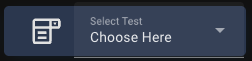
A slim control for Home Assistant select entities, embedding the native dropdown inside a button card. Supports per-option icons and icon colours through variables.state.
Select Inherits
- show_only_icon
- no_actions
Select Variables
| Variable | Values | Default | Description |
|---|---|---|---|
name |
String | Select |
Default label shown next to the dropdown. |
secondary_info |
none | last-changed | last-updated | ... |
none |
Secondary info mode to pass to the embedded entity row. |
state |
Array of Select State Items | [] |
Match select option values to custom icons and icon colours. |
Select State Item
| Property | Values | Default | Description |
|---|---|---|---|
value |
Select option value | The exact option value to match against entity.state. Required |
|
icon |
mdi:* |
Entity icon | Icon to show while this option is selected. |
color |
String (CSS) | var(--primary-text-color) |
Icon colour to use while this option is selected. |
Select Example YAML
See the YAML...
type: custom:button-card
template: select
entity: select.theme_mode
variables:
  secondary_info: last-changed
  state:
    - value: "Relax"
      icon: mdi:sofa-outline
      color: "#febe6e"
    - value: "Focus"
      icon: mdi:desk
      color: "#1a89f5"
Info Card (info)
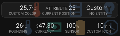
The Info card is for displaying entities and their states or attributes. It's great for displaying sensors. You can display up to 4 items in an info card.
Info Inherits
- cbcjs
- no_actions
Info Variables
| Variable | Values | Default | Description |
|---|---|---|---|
items |
Array of Info Items | [] |
A list of up to 4 items. See the Info Item table below for available properties Required |
mini |
Boolean | false |
Display using the info_mini template rather than the info_item one |
icon_color |
String (CSS) | var(--state-icon-color, var(--paper-item-icon-color)) |
Set the color of the icons. This will be overridden by a color set on any individual items. |
Info Item
| Property | Values | Default | Description |
|---|---|---|---|
entity_id |
Any entity | The entity_id of the item |
|
attribute |
entity.attributes.* |
The id of any attribute of the entity specified above. If provided the value of the attribute will be used rather than the entity state. | |
state |
String | Providing this will completely override the entity_id and attribute states and display this string instead. You don't need to specify an entity_id if you use this. |
|
units |
String | The entity attribute unit_of_measurement |
Set a custom unit of measurement for the displayed value |
prefix_units |
Boolean | false |
Display the units in front of the value rather than after. Automatically true for $ and € units |
decimals |
Number | Round the value to the specified number of decimal places (0 for a whole number). Automatically 2 for $ and € units |
|
name |
String | The entity friendly_name or the attribute name |
Set a custom display name for the item |
icon |
mdi:* |
The entity icon | The icon for the entity. |
color |
String (CSS) | variables.icon_color |
Set a custom color for the icon |
Info Example YAML
See the YAML...
# ...
- type: custom:button-card #                     ####| Info x 3 |####>
  template: info
  variables:
    items:
      - entity_id: sensor.temperature
        name: Custom Color
        color: '#e04632'
        decimals: 2
      - entity_id: cover.blinds
        attribute: current_position
        units: 'ATTRIBUTE '
        prefix_units: true
      - icon: mdi:lightbulb-variant
        name: No Entity
        state: 'Custom'
- type: custom:button-card #         ####| Info x 4 Transparent |####>
  template:
    - info
    - transparent
  variables:
    items:
      - entity_id: sensor.temperature
        name: Rounding
        decimals: 0
      - icon: mdi:cash
        name: Currency
        state: '47.3'
        units: '$'
        color: "#00b59d"
      - entity_id: sensor.battery
        name: "Sensor"
        color: "#febe6e"
      - entity_id: input_number.some_counter
        name: Custom Icon
        icon: mdi:clock-outline
Mini Info (info_mini)
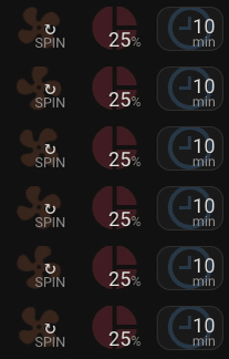
Displays the icon and state of an entity only. Good for displaying information next to a title in a horizontal-stack. You can choose between stack and inline layouts for the state and units. Specify the entity and optionally icon properties then the other options are in variables.
Mini Info Inherits
- cbcjs
- button_mini
- no_actions
- info_helper
Mini Info Variables
| Variable | Values | Default | Description |
|---|---|---|---|
layout |
stack | inline |
stack |
stack will show the state with units underneath and inline shows the state followed by the units. |
show_name |
Boolean | false |
Show a small name label under the value. |
attribute |
entity.attributes.* |
The id of any attribute of the entity specified above. If provided the value of the attribute will be used rather than the entity state. | |
state |
String | Providing this will completely override the entity and attribute states and display this string instead. |
|
units |
String | The entity attribute unit_of_measurement |
Set a custom unit of measurement for the displayed value |
prefix_units |
Boolean | false |
Display the units in front of the value rather than after. Automatically true for $ and € units |
decimals |
Number | Round the value to the specified number of decimal places (0 for a whole number). Automatically 2 for $ and € units |
|
icon_color |
String (CSS) | var(--state-icon-color, var(--paper-item-icon-color)) |
Set a custom color for the icon |
icon_opactiy |
Number | 0 |
Override icon opacity (transparent templates default to full opacity). |
icon_offset_x |
Number/String | 0 |
Horizontal offset for the icon (percentage or CSS length). |
icon_offset_y |
Number/String | 0 |
Vertical offset for the icon (percentage or CSS length). |
rotate is supported as an alias for spin.
Mini Info Example YAML
See the YAML...
# ...
- type: custom:button-card #                     ####| Spin |####>
  template:
    - transparent
    - info_mini
  entity: cover.den_blinds
  variables:
    attribute: current_position
    units: 'SPIN'
    state: '↻'
    rotate: true
    icon_color: 'rgba(247, 138, 80, 0.2)'
  icon: mdi:fan
- type: custom:button-card #                   ####| Inline |####>
  template:
    - info_mini
    - transparent
  entity: sensor.percentage
  icon: mdi:chart-pie
  variables:
    icon_color: 'rgba(157, 48, 66, 0.4)'
    layout: inline
    attribute: current_position
    units: '%'
  - type: custom:button-card #               ####| Background |####>
    template: info_mini
    entity: input_number.some_time
    icon: mdi:clock-time-nine-outline